
Creating digital experiences that feel intuitive and seamless relies heavily on understanding and implementing natural navigation patterns. Users approach interfaces with ingrained expectations formed by prior experiences on websites, apps, and software platforms. Meeting these expectations, while subtly guiding behavior, is key to fostering satisfaction and reducing friction. One of the foundational principles in crafting such experiences is predictability. Predictable navigation provides users with cues about what to expect next, whether through visual hierarchy, consistent labeling, or familiar layout conventions. When users can anticipate where they will go after clicking a link or pressing a button, they feel a sense of control, which reduces anxiety and encourages deeper engagement. Predictability does not mean staleness; it means offering a coherent framework in which novel elements can still surprise and delight without causing confusion.
Another core aspect is the alignment of mental models. Each user arrives with a pre-existing understanding of how similar systems function. Designing navigation that resonates with these mental models minimizes cognitive load. For example, a shopping application should present categories and filters in ways that reflect how users think about products, rather than following an internal organizational logic that is opaque to outsiders. Card sorting studies, user interviews, and observing real-world tasks can reveal how users categorize information, allowing designers to map navigation paths that feel natural. The closer the system’s structure mirrors user expectations, the less effort users expend figuring out where to go next.
Affordances, or design cues indicating possible actions, are also critical. Buttons, menus, and interactive elements must communicate their functionality clearly. Subtle cues such as shadows, gradients, and motion can indicate clickability, while text labels provide explicit clarification. When users instantly recognize what is actionable and what is not, navigation feels effortless. Consistency in these affordances across an entire platform ensures that users don’t have to relearn interactions as they explore different areas, reinforcing a sense of mastery over the environment.
Microinteractions enhance the perception of smooth navigation by providing immediate feedback on user actions. A menu that smoothly slides open or a button that subtly changes state upon clicking confirms to the user that their input has been registered. These tiny moments of feedback are more than decorative; they serve as signals that strengthen the mental model of the system’s behavior. They also reduce errors, as users can quickly identify when an action has or has not taken effect. Thoughtful timing and pacing of these interactions are essential, as abrupt or sluggish responses can break the illusion of a fluid interface.
Another consideration is the principle of progressive disclosure, which balances simplicity and depth. Users should be presented with only as much information as is necessary at any given point, while deeper layers of functionality remain accessible without overwhelming the initial view. Navigation menus that expand on demand, contextual options that appear when relevant, and nested structures that remain logically grouped all contribute to a sense of natural flow. This approach respects the user’s attention and allows for a gradual, intuitive learning of the system’s capabilities.
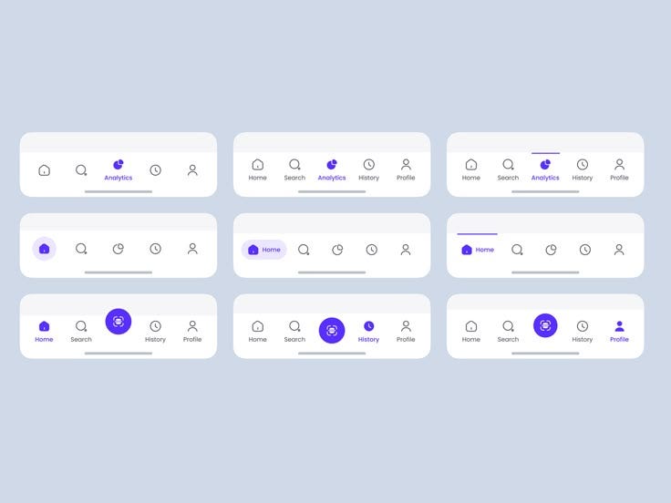
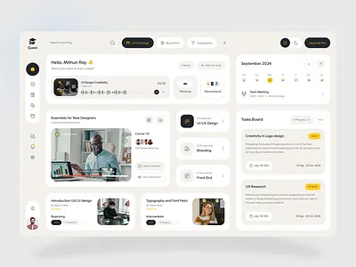
The spatial organization of elements plays a significant role in navigation fluidity. Humans are highly attuned to visual patterns and spatial relationships, often navigating interfaces similarly to physical environments. Aligning related items, creating clear separation between sections, and using whitespace strategically can guide the eye along intended paths. Familiar patterns, such as top navigation bars for primary categories or side panels for secondary options, exploit these spatial heuristics. Responsive design further enhances this by maintaining navigational coherence across different device sizes, ensuring that natural patterns are preserved whether on desktop, tablet, or mobile.
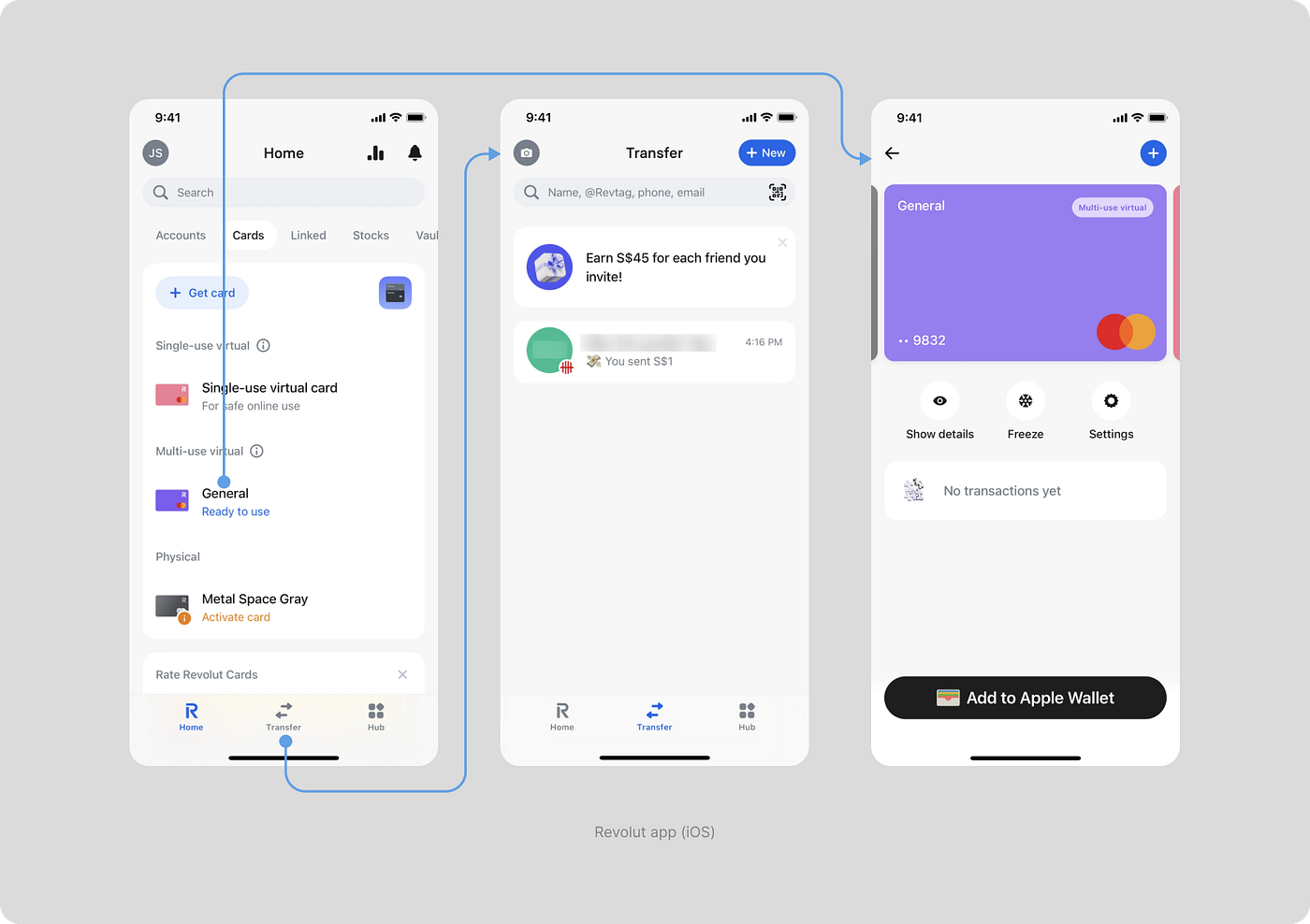
Pathfinding mechanisms such as breadcrumbs, search, and contextual links also contribute to a sense of orientation. Breadcrumbs allow users to trace their journey backward effortlessly, reinforcing their understanding of the system’s structure. Search functions provide a shortcut to destinations without forcing exploration through the full hierarchy. Contextual links connect related content, offering intuitive detours without derailing the user’s primary task. When integrated thoughtfully, these mechanisms reduce the anxiety associated with getting lost in complex digital spaces and create a more confident navigation experience.
Cognitive load management is another essential factor. Navigation should minimize the mental effort required to make choices. This includes limiting the number of options presented at once, grouping items meaningfully, and avoiding redundant paths that could introduce ambiguity. The use of familiar iconography, short descriptive labels, and predictable placement of interactive elements reduces decision fatigue, allowing users to focus on their goals rather than deciphering the interface.
Adaptive navigation that responds to user behavior can further enhance natural flow. Predictive menus, personalized shortcuts, and recently accessed items anticipate user needs, creating a sense of the system “knowing” the user without being intrusive. These features, when implemented subtly, can reduce repetitive actions and streamline workflows, making the interface feel more responsive and intelligent.
Accessibility considerations are inseparable from natural navigation. Clear visual cues, keyboard navigability, screen reader compatibility, and color contrast ensure that navigation feels intuitive to a broader range of users, not just those with conventional interaction patterns. Inclusive design fosters trust and comfort, making natural navigation a universal experience rather than a selective privilege.
Finally, testing and iteration are vital to refine navigation patterns. User testing uncovers friction points, unexpected behaviors, and areas of confusion that designers might overlook. Iterative design, informed by real-world usage, ensures that navigation continuously evolves to meet user expectations. Observing how different users traverse the interface provides insights into which paths feel intuitive and which require restructuring. This feedback loop is crucial for maintaining an experience that consistently feels natural, even as content and features expand.
Ultimately, natural navigation emerges from a blend of predictability, cognitive alignment, clear affordances, responsive feedback, spatial clarity, progressive disclosure, pathfinding aids, adaptive personalization, and inclusive design. By weaving these principles together, designers create digital environments where users move seamlessly, accomplish goals efficiently, and enjoy the interface intuitively, as if the system itself anticipates their needs. When navigation feels like an extension of human thought rather than an imposed structure, users develop trust, engagement, and loyalty, making the experience not just usable, but genuinely enjoyable.



Leave a Reply