
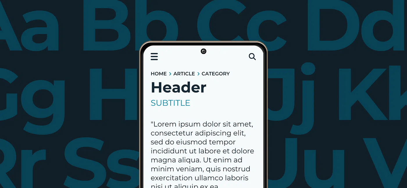
Typography in interface design is far more than just selecting attractive fonts; it is a critical component that directly impacts user comprehension, interaction efficiency, and overall satisfaction. In digital platforms, where users rely heavily on visual cues to navigate, the clarity and consistency of typography can make the difference between intuitive experiences and confusing, frustrating interactions. Every interface element, from headings and body text to buttons and labels, relies on type as a primary vehicle for communication. When typography is thoughtfully applied, it guides users seamlessly through content, reinforces hierarchy, and enhances readability, ultimately shaping how efficiently information is processed.
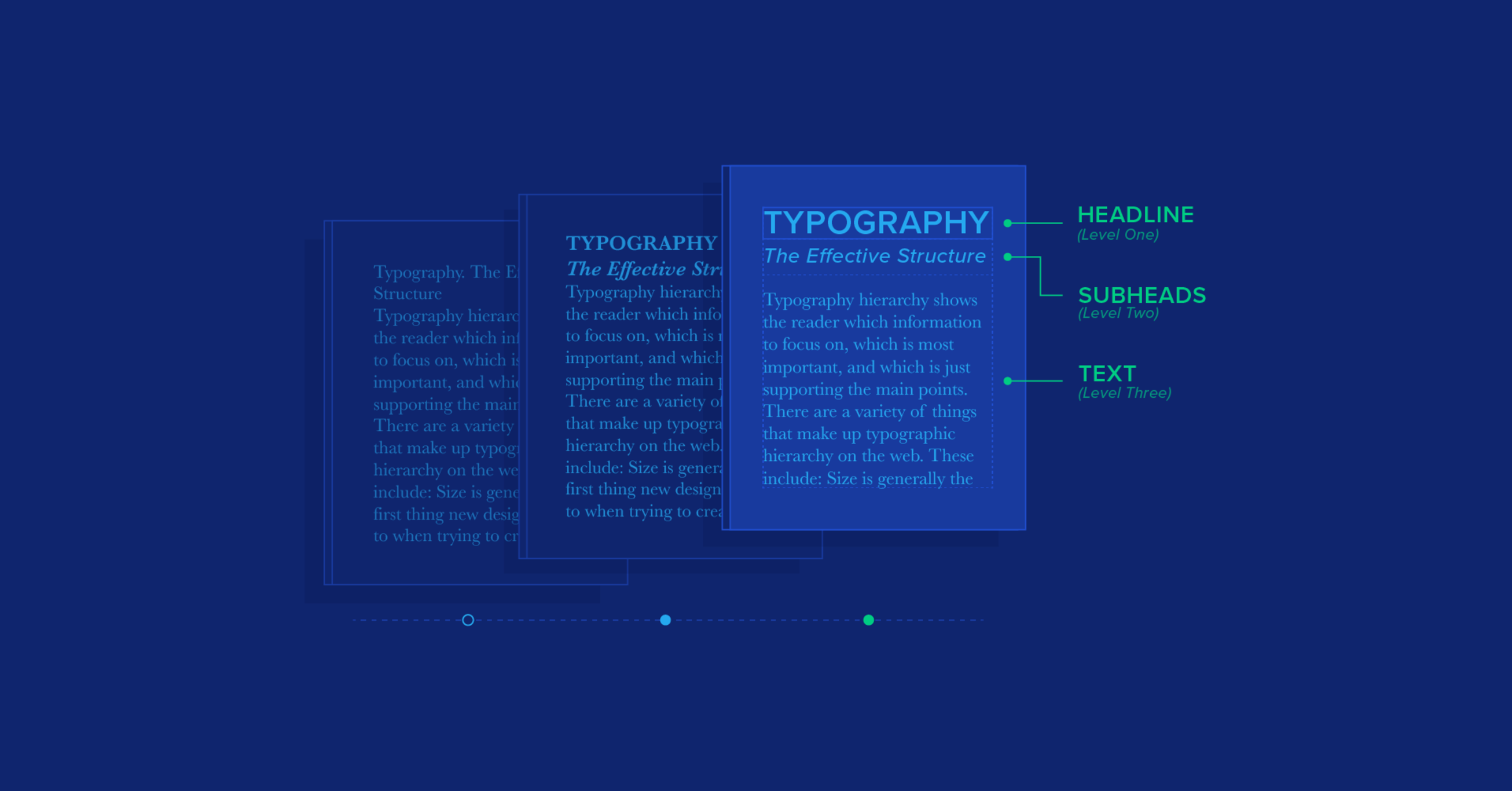
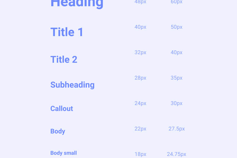
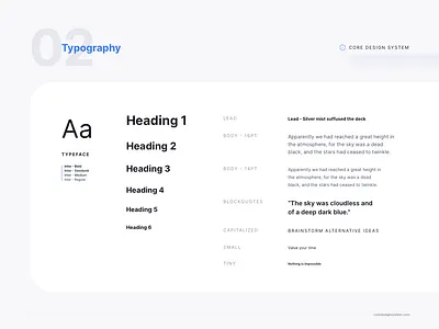
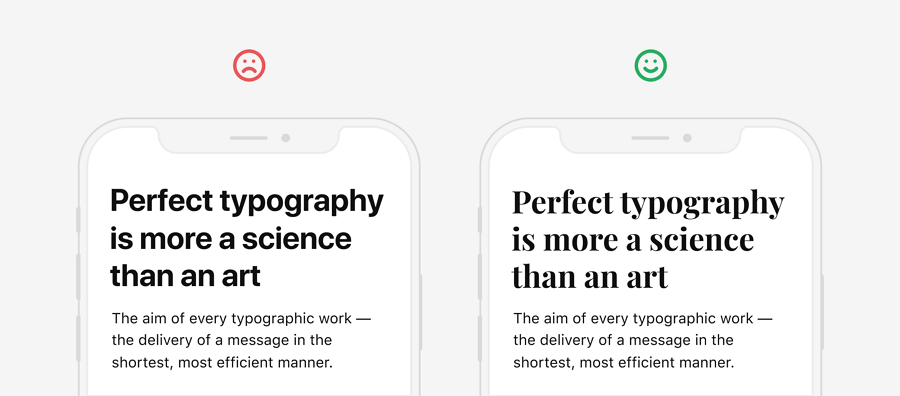
A foundational principle in typography for interface clarity is hierarchy. Effective hierarchy ensures that users can easily distinguish between primary and secondary information, allowing them to prioritize tasks without unnecessary cognitive load. Designers achieve this by varying type size, weight, spacing, and style. For example, headings often use larger, bolder fonts to signal prominence, while supporting text may employ smaller, lighter weights. This visual stratification not only organizes content but also communicates relationships between elements, allowing users to understand structure at a glance. Without clear hierarchy, interfaces risk appearing chaotic, and users may struggle to identify actionable items or critical information.
Consistency across an interface is equally vital. A unified typographic system establishes predictable patterns that users internalize, reducing the mental effort required to interpret information. When headings, buttons, labels, and body text follow consistent typefaces, sizes, and spacing conventions, users can navigate the interface intuitively. Inconsistent typography can create confusion, diminish trust, and slow task completion, as users expend extra energy deciphering variations. Standardizing typographic rules, often through design systems or style guides, provides a framework that maintains visual cohesion across multiple screens, components, and devices.
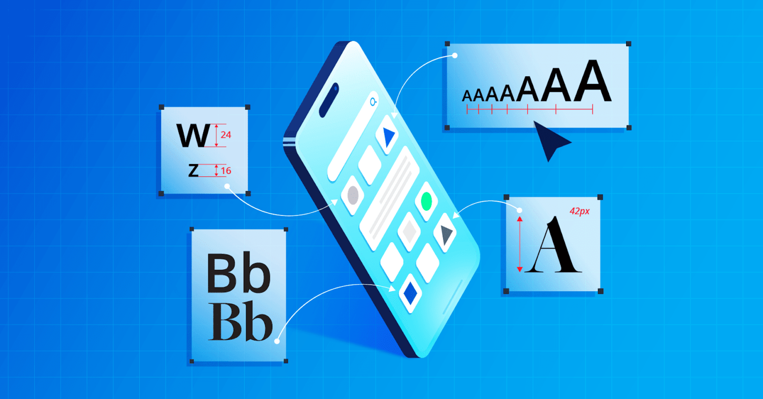
Legibility is another cornerstone of effective typographic systems. This refers to how easily individual characters can be recognized, which is influenced by factors such as font selection, size, weight, contrast, and line spacing. Sans-serif fonts are commonly favored for digital interfaces due to their clean, simple forms that render well on screens of varying resolutions. Adequate line height and spacing prevent crowding, while sufficient contrast between text and background ensures readability under diverse lighting conditions. In mobile interfaces, where screen real estate is limited, legibility becomes even more critical. Small or overly intricate typefaces can impede comprehension, leading to user frustration and errors. Designers must balance aesthetic considerations with functional readability, ensuring that text communicates information effectively without compromising style.
Spacing and alignment also play a significant role in interface clarity. Proper use of margins, padding, and line spacing contributes to a sense of order, allowing users to scan content efficiently. Text blocks that are too dense or unevenly aligned can overwhelm users and obscure important information. Conversely, well-structured spacing facilitates visual separation of elements, emphasizing key messages while maintaining a clean, approachable layout. Alignment reinforces hierarchy and flow, guiding the eye naturally from one section to another. A consistent grid system can support this by providing structural anchors that maintain visual rhythm across pages and components.
Typography interacts with other design elements, including color, imagery, and interactive components, to enhance clarity. Contrast in color can highlight important text, while typographic emphasis such as bold or italic styles can signal alerts or actions. However, overuse of color or emphasis can dilute impact and create noise, so subtlety and restraint are essential. Similarly, integrating typography with interactive elements, such as buttons or menus, requires careful consideration of size, spacing, and weight to ensure accessibility and clickability. The goal is to create an interface where text communicates meaning efficiently while remaining aesthetically harmonious with other visual elements.
Responsive design introduces additional considerations for typography. Interfaces must adapt to different screen sizes, resolutions, and orientations, maintaining readability and hierarchy across contexts. Scalable type systems, often based on relative units rather than fixed pixels, allow text to adjust proportionally, preserving usability on smartphones, tablets, and desktops alike. Breakpoints and media queries enable designers to fine-tune typographic behavior, ensuring that headings remain prominent, line lengths are manageable, and spacing is adequate regardless of device. Responsive typography is essential for maintaining clarity in a multi-device ecosystem, where inconsistent scaling can disrupt flow and comprehension.
Accessibility is inseparable from typographic clarity. Interfaces must accommodate users with varying visual abilities, ensuring that text remains readable under conditions such as color blindness, low vision, or screen magnification. Guidelines like the Web Content Accessibility Guidelines (WCAG) provide standards for contrast ratios, font sizes, and line spacing that promote inclusivity. Typography that meets accessibility criteria not only broadens the user base but also reinforces trust and usability, signaling that the platform is attentive to all users’ needs. Accessible typography may involve adjustable text sizes, high-contrast modes, or dynamic line heights to cater to individual preferences, contributing to a more equitable user experience.
Microtypography, or the subtle refinement of letter spacing, word spacing, and kerning, further enhances clarity. Small adjustments can dramatically improve legibility and reading comfort, especially in dense informational interfaces. Proper attention to microtypography ensures that text appears balanced and polished, reducing visual fatigue during prolonged interaction. In combination with broader typographic decisions, these refinements contribute to an overall perception of professionalism and reliability, signaling that the platform prioritizes both aesthetics and functionality.
Ultimately, typography in interface design functions as both a visual language and a usability tool. Well-executed typographic systems clarify structure, emphasize important information, and facilitate effortless navigation. They reduce cognitive load, support accessibility, and create a cohesive visual experience that guides users intuitively. By carefully selecting typefaces, establishing hierarchy, ensuring legibility, maintaining consistency, and integrating responsive and accessible practices, designers craft interfaces that communicate effectively and feel comfortable to use. Typography is not merely decorative; it is a core mechanism through which digital platforms convey meaning, build trust, and enhance user satisfaction. Thoughtful typographic design is an investment in clarity, efficiency, and positive user experiences, ultimately shaping how information is perceived, understood, and acted upon in digital environments.


Leave a Reply